Whenever I stumble upon the exquisite bottlings of That Boutique-y Whisky Company, I cannot take my eyes off them. Not only do they contain excellent drams, but also do they sport one-of-a-kind designs. The comic-styled labels that grace these precious single cask whiskies are often a little crazy and always great fun! So I was very happy when I got into contact with Emily Chappell, the Glasgow-based illustrator behind these one-of-a-kind artworks, and she agreed to answer a few questions regarding her work.
Barley Mania: By now, you told me, your artworks have been used on over 100 different bottlings by That Boutique-y Whisky Company. Wow! When did you start working for those guys and how did you land that gig?
Emily Chappell: The beginnings of my Boutique-y involvement were in Spring 2012. A friend of mine (a friend I happened to have got to know whilst on a Loch Lomond booze cruise – ahem!) had been working with the guys at Master of Malt for a while, and mentioned that they were looking for an illustrator. It was a trial brief to design a graphic novel type label for a limited release of Port Ellen.
Ben (chief operator of the dream machine [brief maker] at Boutique-y headquarters) had a pretty clear idea of who and what should be on the label, but it was up to me to design the layout and get a likeness for the cover star – Jon Beech (AKA Jan Birch). Anyway, I was hired, and the rest is… damn fine whisky. Aside from the addition of aged statements, and some re-jigging along the way, this label pretty much set the style and format for the rest.
BM: How does the creation of a label for a new release by That Boutique-y Whisky Company typically go down? Do you get a detailed briefing beforehand or do they just point you into a certain direction and leave the rest to your imagination? Let’s take the 15 years old Secret Distillery #2 bottling, for example. How the hell did a flock of whisky drinking ostriches with grinning human heads end up on that bottle!? :D
EC: Ha! That’s one of my favourites. It’s creepy. It’s funny. It’s unhinged. I love it! I am positive we are dealing with the occult with some of these labels. Ben comes up with some amazing briefs. He should write up some of them as movie pitches. They are usually pretty detailed and show an awareness of how they could be composed on the label – as well as the possible effects of eating too much cheese before bedtime!
For Batch 1 the brief began “I’d like a scene that incorporates sixteen swan/human hybrids”. A typical start to a Boutique-y brief. The brief for Batch 2 was to make everything behind the tinted specks ‘pinkified’. Candy canes and pink liquorice allsorts were mentioned, but who knew the level of madness those Cheshire cat grins would unleash?
BM: If you could pick one fantasy whisky – distillery, age, cask, ABV – to work on, what would that be? And what would the label of that fantasy whisky look like?
EC: There is a Boutique-y label on the horizon that comes pretty close. It’s Bourbon. Say no more, say no more. But for fantasy purposes, let’s imagine a mythical Glasgow whisky. The year is 2050. The whisky is made from the waters of the Molendinar Burn (now clean!!!). Our label vision is a view of the river Clyde (also now clean!!). Long since being used as a shipbuilding powerhouse, the Clyde is now a massive water park. The Titan Crane is a giant helter-skelter waterslide and there are lots of whisky bars along the river. The sun is shining (ahem!) and there’s a general Willy Wonka madness to the scene. Let’s have it aged 10 years, 40%, and aged in ex-bourbon casks. A whisky that lightens the soul and is good company.
BM: While I became aware of your art through your whisky labels, they are by far not the only thing you do. What else do you create illustrations for? And what is the best way for people to learn more about your work and get in touch with you?
EC: I tend to get a lot of commissions for the food and drink industry, but also a lot for local projects here in Glasgow related to social enterprise and the growing of food. Following on from that, I’ve written and illustrated a book called A Hut of One’s Own – How to Make the Most of Your Allotment Shed. It’s packed full of hand-drawn huts, greenhouses and inventions, and its aim is to promote non-gentrified spaces where creativity and eccentricity abound.
I also make surreal screenprints and drawings, again usually based around the loose theme of food. Food is a great way in which to hold the mirror up to society, as well as bring people together through a common interest. Lots more stuff here at – www.emilychappell.com.
by Tobi
-
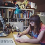
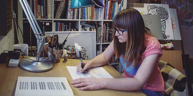
- Emily at work
-
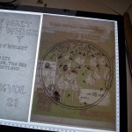
- Work in progress, pt.1
-

- Work in progress, pt.2
-

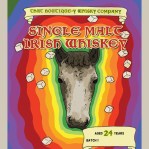
- Whisky label, pt.1
-

- Whisky label, pt.5
-

- Whisky label, pt.3
-

- Whisky label, pt.4
-
- Whisky label, pt.5
Emily Chappell – Official Website: http://emilychappell.com/
That Boutique-y Whisky Company – Official Website: http://www.thatboutiqueywhiskycompany.com/
